
Alto is an architecture and interior agency specializes in
the intersection of functionality
and culture.
the intersection of functionality
and culture.


This is an academic project to create a 2023 Sustainability report for Lululemon based on their brand guidelines. The visual narrative of this sustainability report is woven with the theme of "Internal & Connective Growth." Through imagery that resonates with nature – featuring elements such as fungi, bark, lichen, anemones, roots, and shell structures – the report encapsulates the essence of growth in its purest form. The choice of textures and motifs reflects not just outward expansion but also the organic, evolving nature of Lululemon's internal processes and core vaues.

While adhering to Lululemon's official font for numerical representation, a blend of "Calibre Practice" for the year 2023 and Helvetica for statistical figures is employed. This pragmatic approach ensures clarity and consistency in conveying vital data while maintaining alignment with the brand's visual language. The tone adopted throughout the report is conversational and transparent, refusing industry jargon in favor of clear, person-to-person communication. By employing a relatable language style, the report aims to bridge the gap between the company and its stakeholders, fostering a deeper understanding of Lululemon's sustainability endeavors.
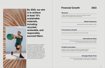


Through all of my overlayed images I made sure to have them interact in some way, so the man’s shoulder continues on as the shadow on the bark, the angle of the bark moves the same as the staircase and railing and the liken on the lower half is the same as the lichen on the boulder the woman is sitting on. I wanted the images to “move” in different directions to mimic how the typography moves like we do.
Lululemon talks about the “red thread” in their photos meaning an element of red as an accent is appropriate but not to be overused. For the winter, I felt like a pop of red in an otherwise muted spread was successful, like winter berries.
For promotional collateral I wanted to nod again to the theme of "Internal and Connective Growth" and felt a journal was a successful addition. As an annually released report I chose to design each spread in order to move the reader through the seasons.